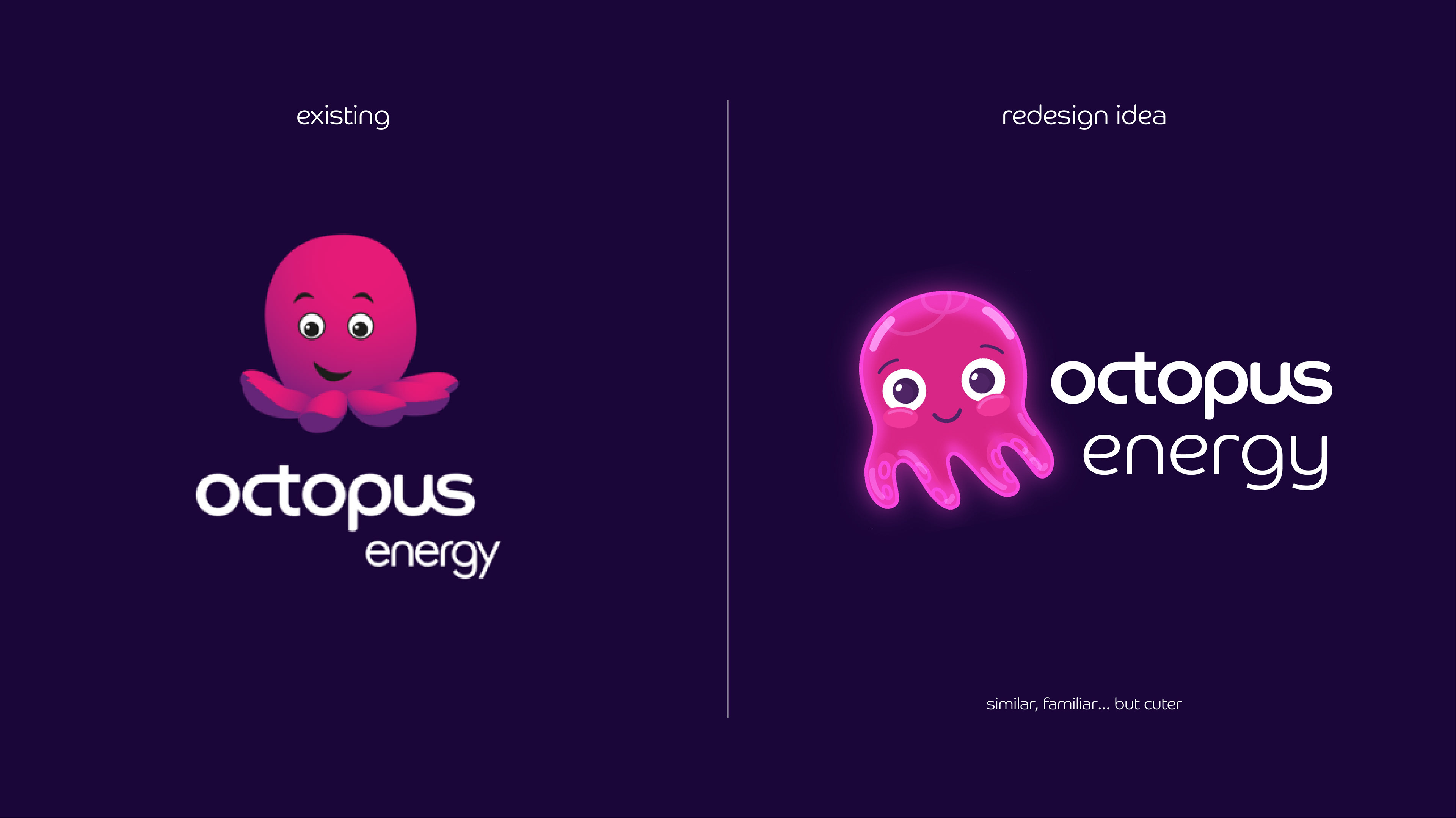

For some reason the Octopus Energy logo has annoyed me for the longest time! I just can't understand why such a major energy company would have a mascot that looks like it was drawn by a kid. I'm probably being really irrational, but it bugged me so much I thought why not give it a re-design.
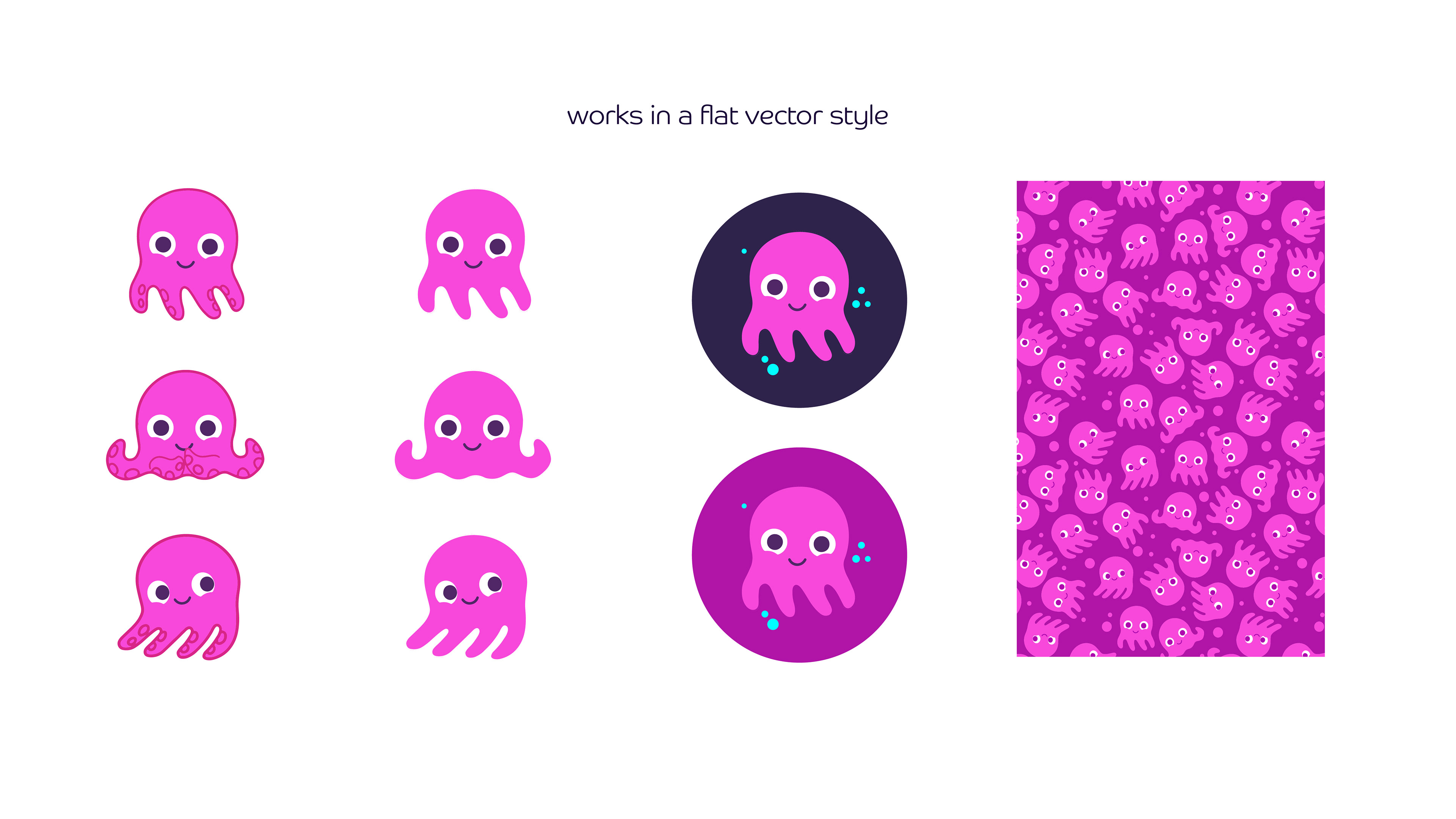
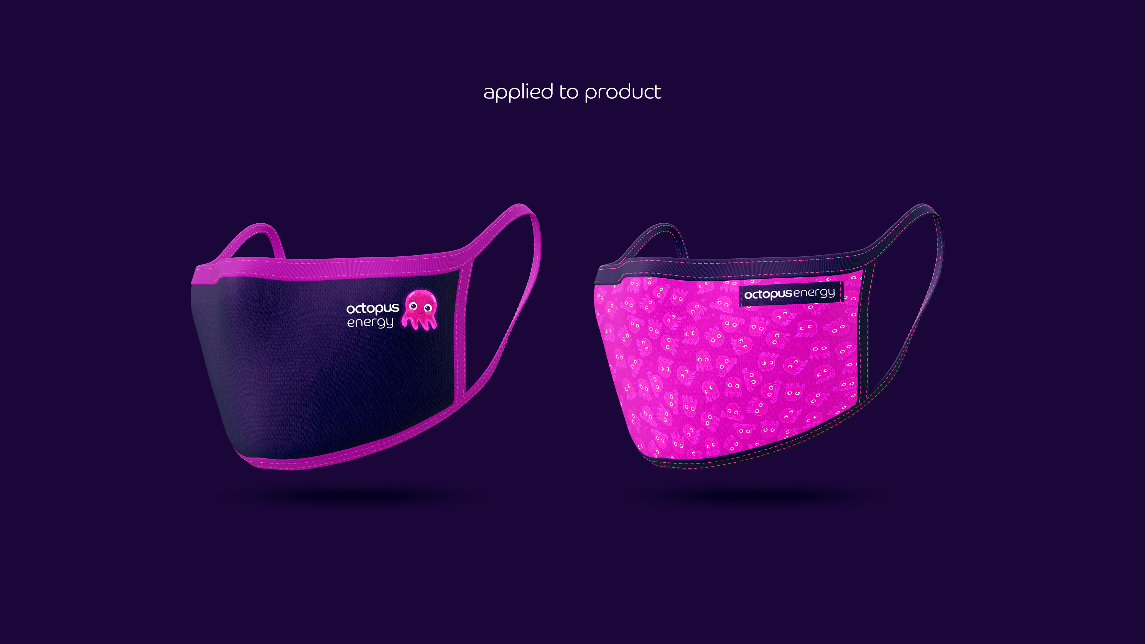
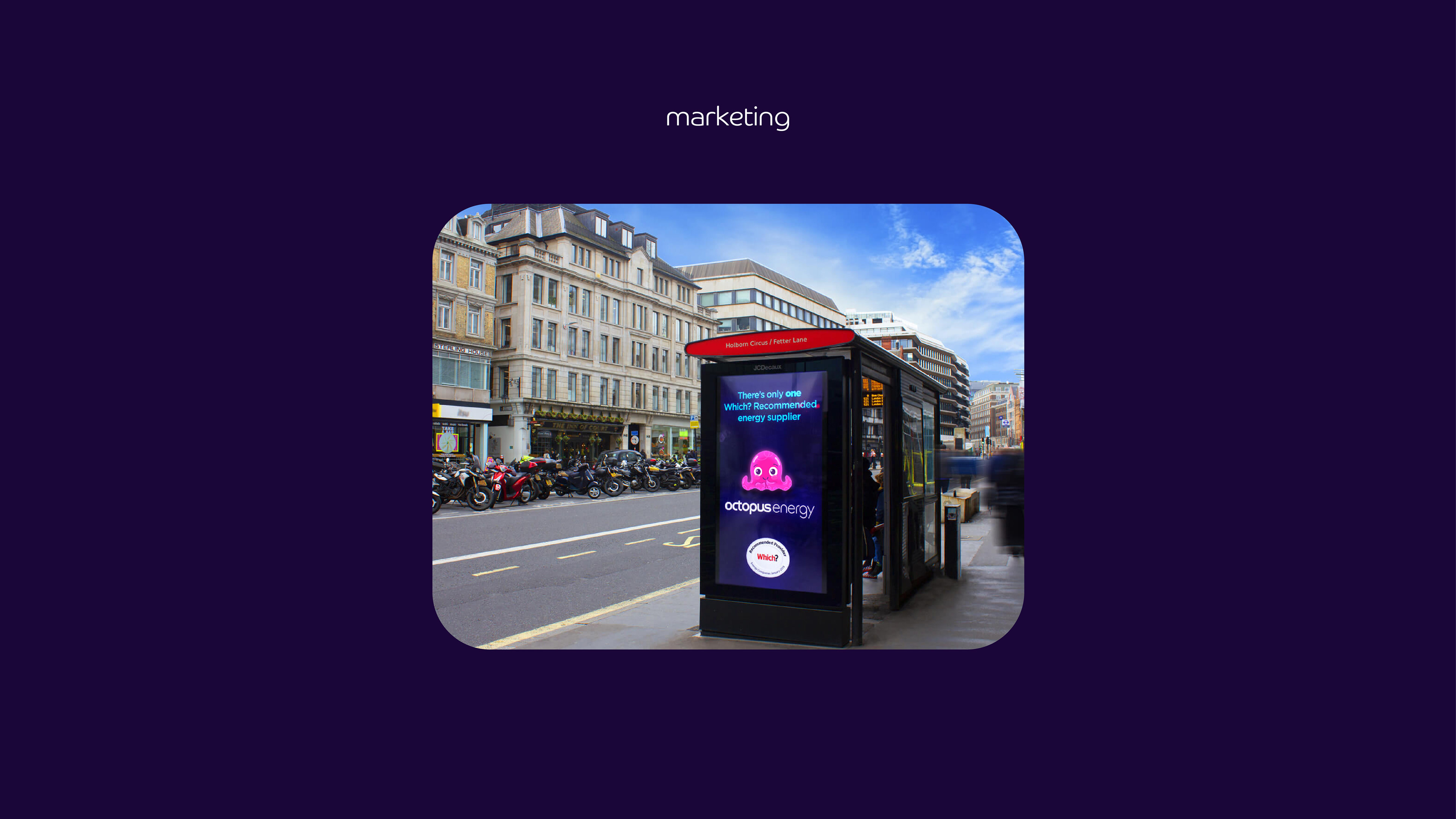
With this re-design I tried to keep the character familiar and similar enough to the current octopus that it is still recognisable as Octopus Energy for clients, think I came up with a nice solution to their pink little problem!
I actually cold called with this design also, because why not! It had only taken two of my baby's nap times to do so wasn't a biggy if they weren't interested. They came back with a very gracious reply and said that they were aware the current octopus wasn't up to scratch and actually already had a new one in the pipeline!
Here is the presentation I sent: