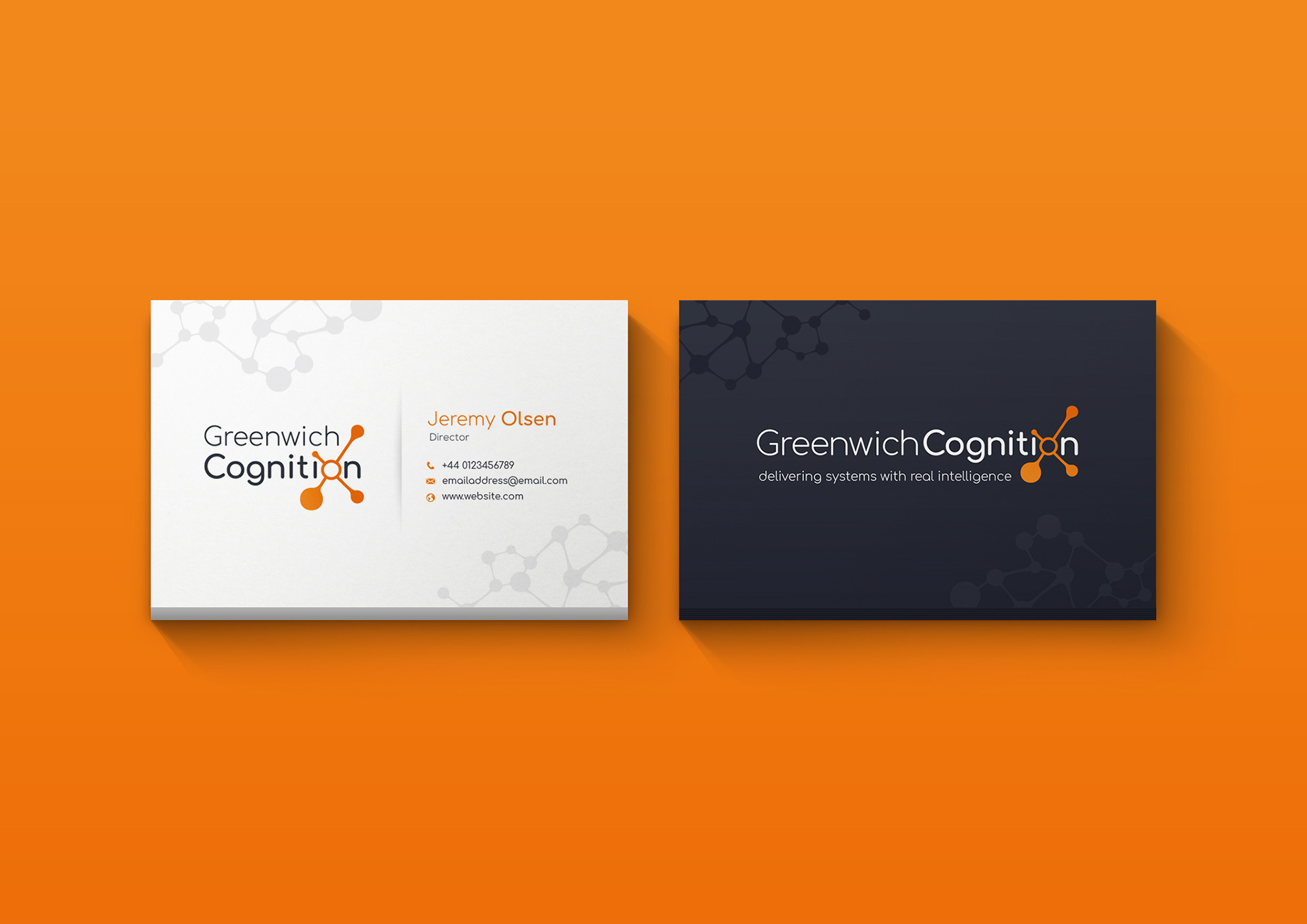
Building the branding for Greenwich Cognition Ltd was a really fun challenge. Though the logo development took a while I'm really happy with the final product, especially the integration of the neutron into the word cognition. The logo works well in a single line and stacked as well as the icon being used in isolation. The result is a strong brand identity originating from quite a clean crisp logo.
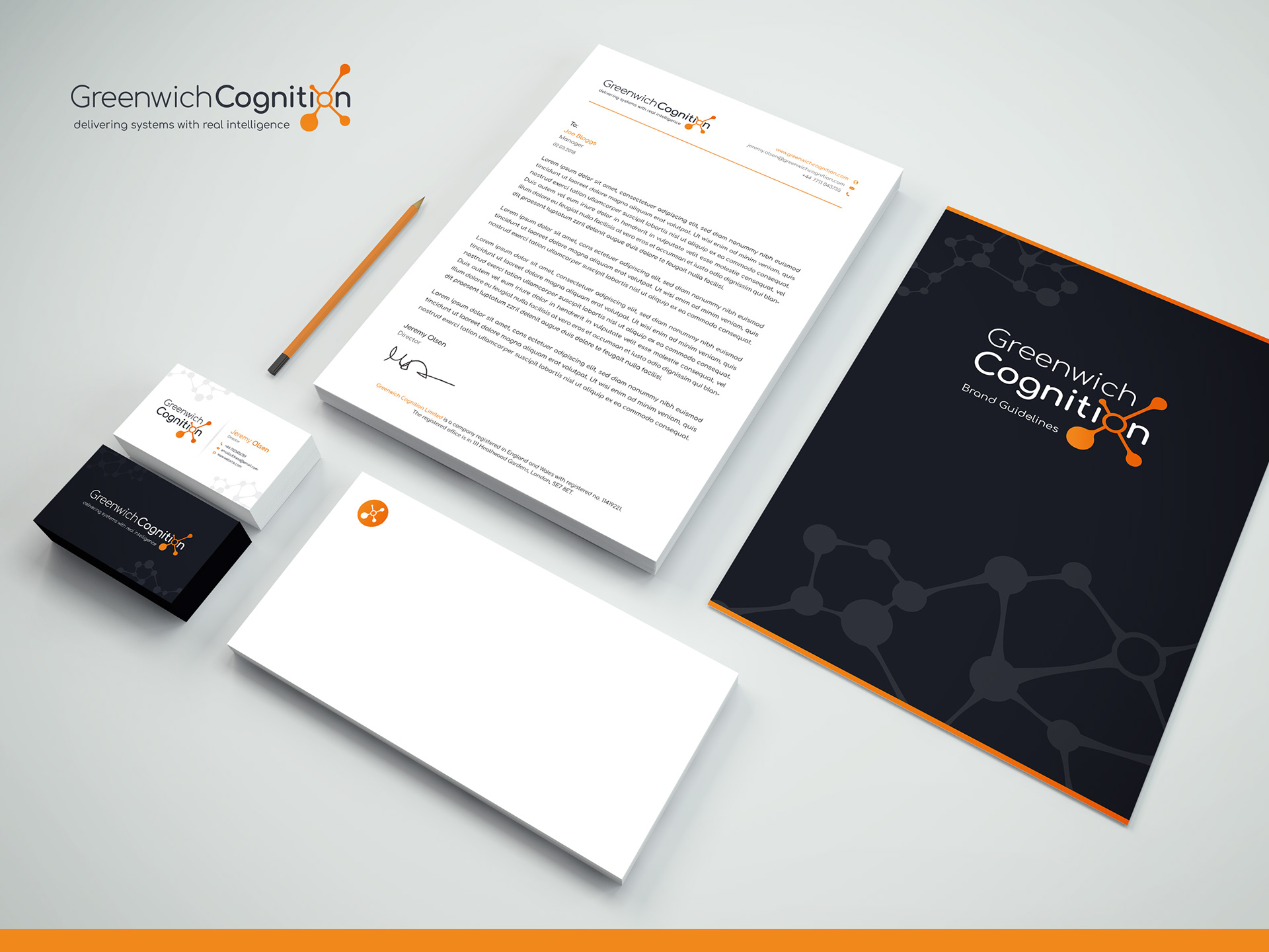
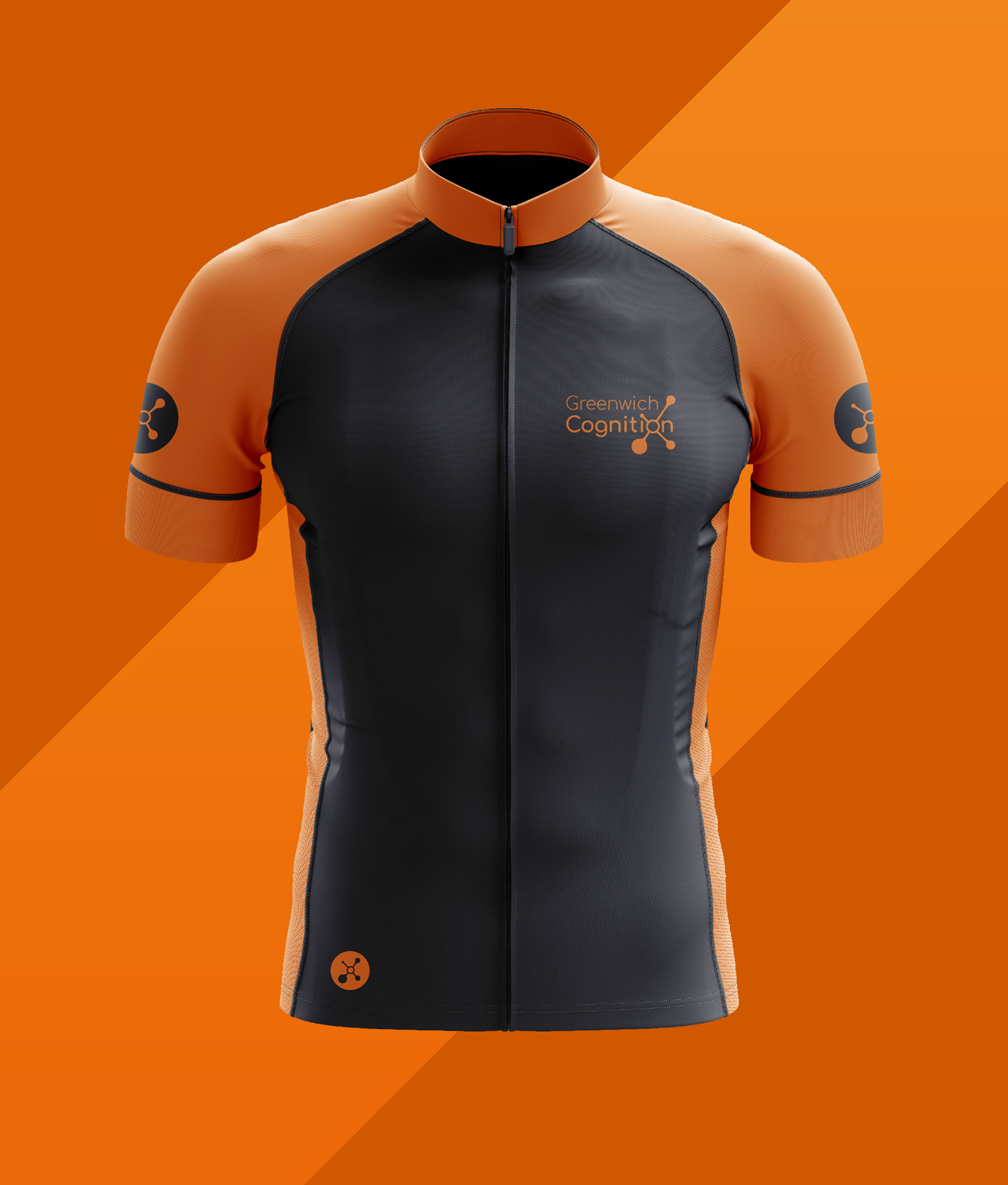
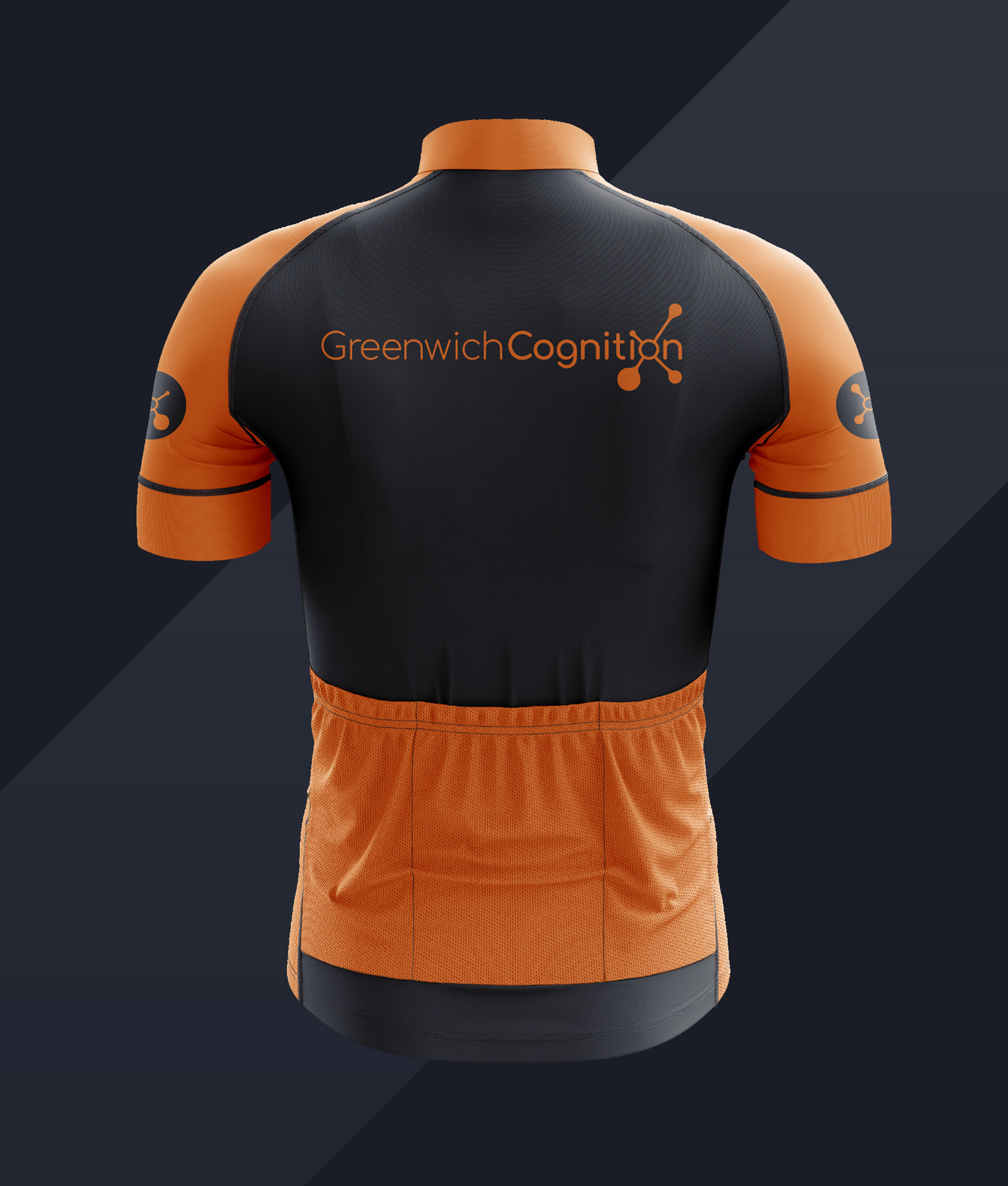
The client wanted to see how his branding could be used across print, web and promotional products. I always enjoy working on branding for a new company or product where you are not influenced by an existing logo and don't have to incorporate existing brand identity to your work.